Whether you work in web or print, you need to understand grid theory – even if you eschew grids. Here’s what you need to know.
(This is an adapted version of this article.)
Grids are like the invisible glue that holds a design together, so whether you work in print or on the web you need to understand grid theory.
Web designers (and developers) have created reusable CSS libraries and frameworks to simplify the process of deploying and leveraging grids to create balanced page layouts.
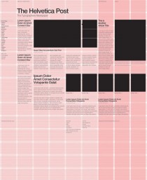
Guide to the grid
We’re here to set that straight with this simple pocket-sized guide to the grid, including a small smattering of theory! While some designers actively eschew grids in favour of a more intuitive, free-form layout, the most successful do so having worked with grids for years – they understand the rules before they break them.
So whether you’re a traditionally-taught designer or just finding your way without any formal training, we’ll help you out with the basic terminology, practice and purpose of the grid. So, with that promise made, let’s get started.
01. Grids establish a meter and rhythm

The foremost purpose of a grid, in graphic design at least, is to establish a set of guidelines for how elements should be positioned within a layout. Not only does an effective grid provide the rhythm for a design, but it also defines the meter.
The rhythm and meter of a layout is an important part of making the content accessible, helping the viewer to understand where to find the next piece of information within the layout. It sets expectations and defines the rules, timbre and – in some cases – voice of the design. Think of a grid as providing the road-map along which your viewers travel.
So, how do you use a grid to establish a meter and rhythm?
02. Grids define and reflect proportion
A key aspect of the grid is its ability to help determine and define proportion. In print, proportions most commonly echo the size of the media; the shape and orientation of the paper are often reflected in the size and shape of images included within a layout, for example. This feels comfortable because the reader subliminally understands the context of the layout as a result of the physical shape and size of the delivery mechanism (in this case, a piece of paper!).
On the web this idea of reflection isn’t quite so important, but grids can be be used in the same way to anchor content back to the screen. Screens can be more fluid, and as a designer it’s not possible to know with the same confidence what size and shape of screen will be used to view content.
Regardless of this, proportion and scale are important tools in a layout so using a grid to determine and enforce rules helps to define that all-important set of signposts that helps the reader to access and understand content.
03. Grids, the rule of thirds, and the golden ratio

The whole concept of a definitive grid ‘system’ is a relatively recent invention in the world of design. Grids have existed intuitively since the earliest days of man drawing and writing, but it’s only recently that layout has been considered in a scholarly fashion, and as such they’ve never existed in isolation from other best-practice, well understood layout tools. One such example of cross-over is where the golden ratio meets the grid.
The golden ratio (also known as the golden mean) determines the most pleasing set of proportions for an element, and is simplified to the ‘rule of thirds’. When used in combination with a grid, these simple rules for size, position and proportion can help ensure a layout feels both coherent within itself, but also appealing aesthetically. Why would you want to appeal in these terms? Because by doing so, you’re making the content more accessible to the reader. Remember that a grid is the invisible glue behind content – in most cases it should be transparent to the viewer.
04. 960 grid systems on the web

Understanding the value and benefit of having a grid system in place, it’s understandable that web designers have moved to adopt grids. The practicalities of using a grid on the web are such that a few common sizes have become the standard, with the most common being the 960px grid system. 960px is a good size because it has many factors (whole numbers it can be divided into): 1, 2, 3, 4, 5, 6, 8, 10, 12, 15, 16, 20, 24, 30, 32, 40, 48, 60, 64, 80, 96, 120, 160, etc. Being able to divide the grid up in this way provides a lot of flexibility for the width of columns, offering a good multi-purpose and reusable grid system. Needless-to-say, numerous designers have been busy wrapping up the 960px grid into a helpful set of CSS libraries. One such example can be found at http://960.gs, but there others available if you look around.
05. Grids provide a foundation and balance
As we’ve seen, grids exist primarily to help determine the position and balance for a layout. This can be used to help ensure that content is presented in an easy-to-understand order, but conversely by providing a firm foundation a grid can also be used to highlight specific areas of content simply by breaking elements outside the grid. The viewer will naturally identify these break-outs and be drawn towards them, giving the designer the opportunity to play with the hierarchy of a layout and tweak the semantic meaning of a piece of work.
06. Grid work with other key design principles

Don’t forget that the grid is just one tool alongside many basic principles you can use to enhance your layouts. Don’t get overly caught up in using a grid rigidly – some of the best designs break all the rules of grid layout and are all the more successful for doing so. Understanding how and when to use or not use a grid can only really come from experience – so experiment! Check out our other articles on design theory to pick up other handy tools and principles you can use to enhance your designs.